This family run Cretan business has been producing thyme honey for three generations, relying on traditional, ancient methods of production. Gazing into the future, the current owner aimed at widening and deepening his client base by creating a labeled, organically certified product that would appeal to knowledgeable customers who seek premium products of excellent taste.
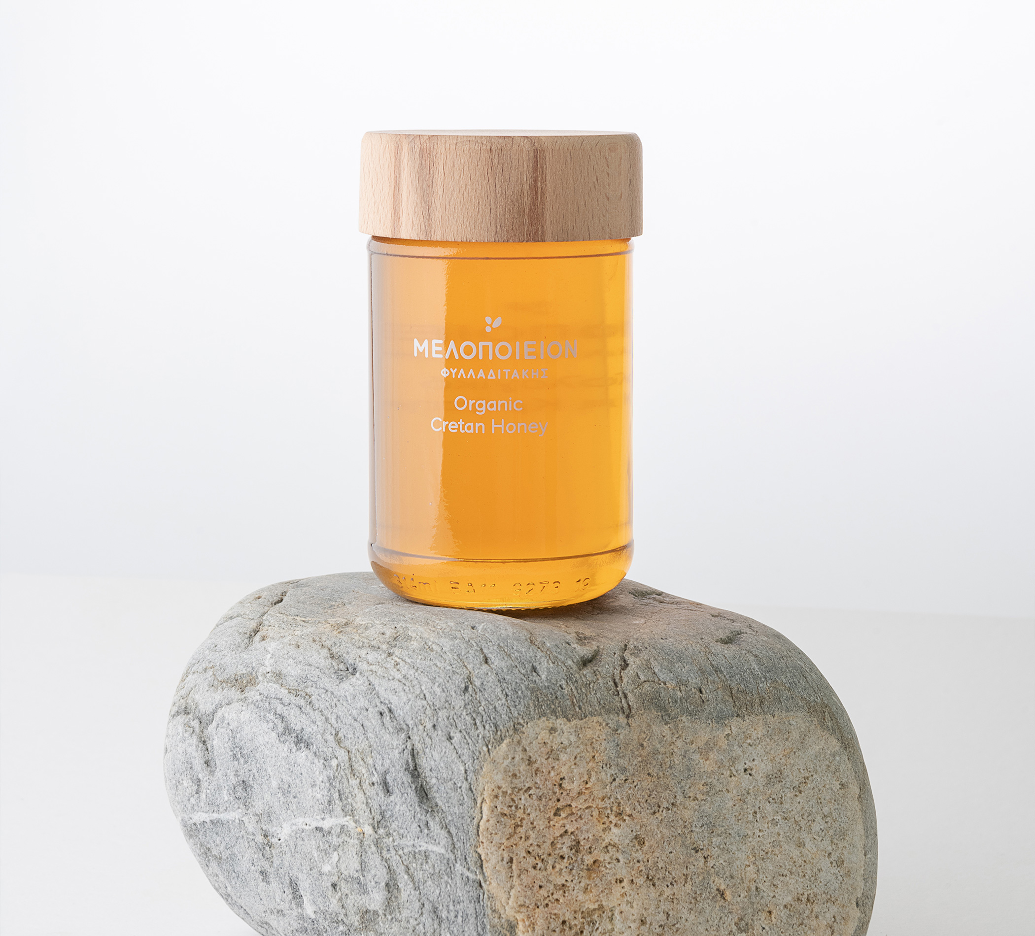
The project’s branding included the logo design and packaging of Melopeion organic thyme honey. The font used for the logo was custom handmade in order to reflect the product’s qualities as a good that is meticulously handpicked by the producer. The discrete addition of an illustrative bee is self-explanatory, yet we went for a very minimalistic approach that followed the brief in general. In terms of packaging, our main concern was to create an eye-catching packaging for the consumer, yet without taking away from the natural appeal of thyme honey (clarity, color). The grayscale colors were emphatically used in order to bring forward the product’s warm, caramel color. The aesthetics of the illustrations were purposefully inspired by naïve art, in order to convey the innocence and purity of the product.