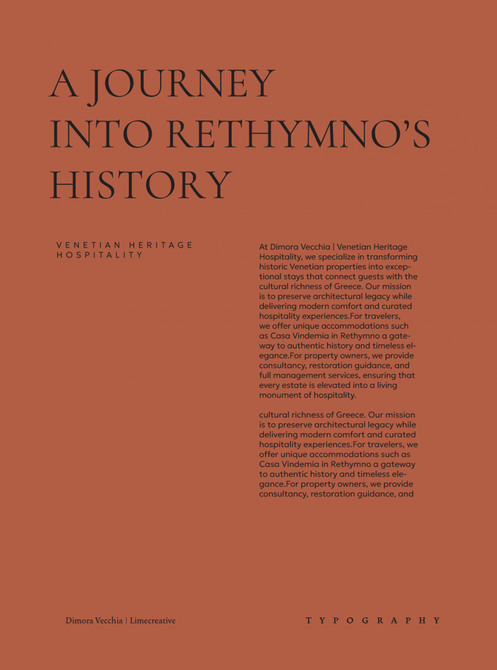
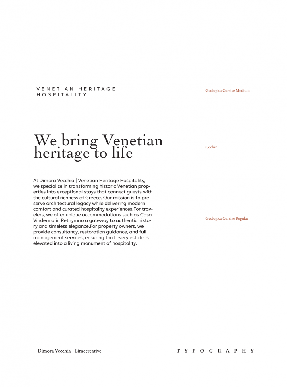
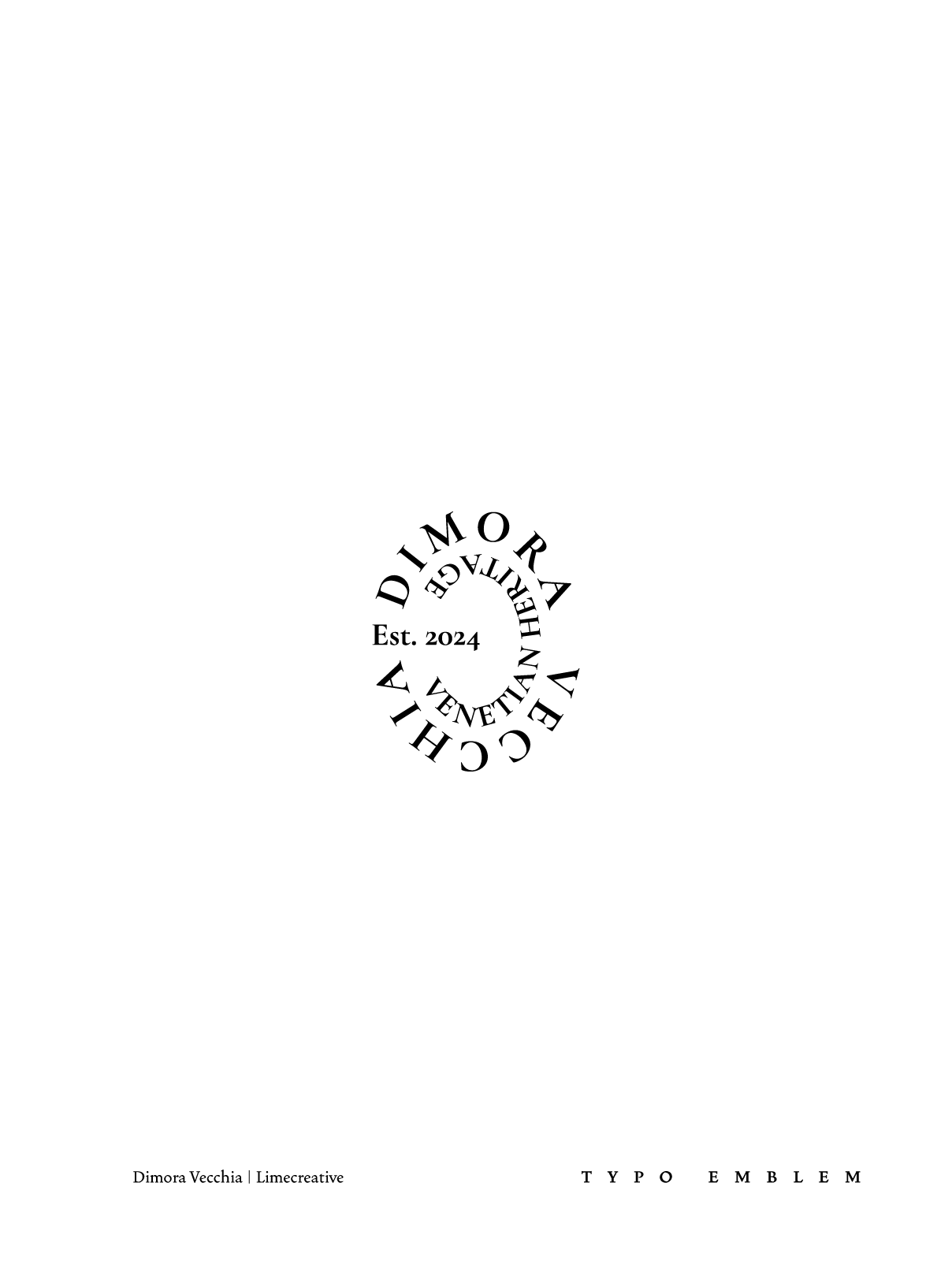
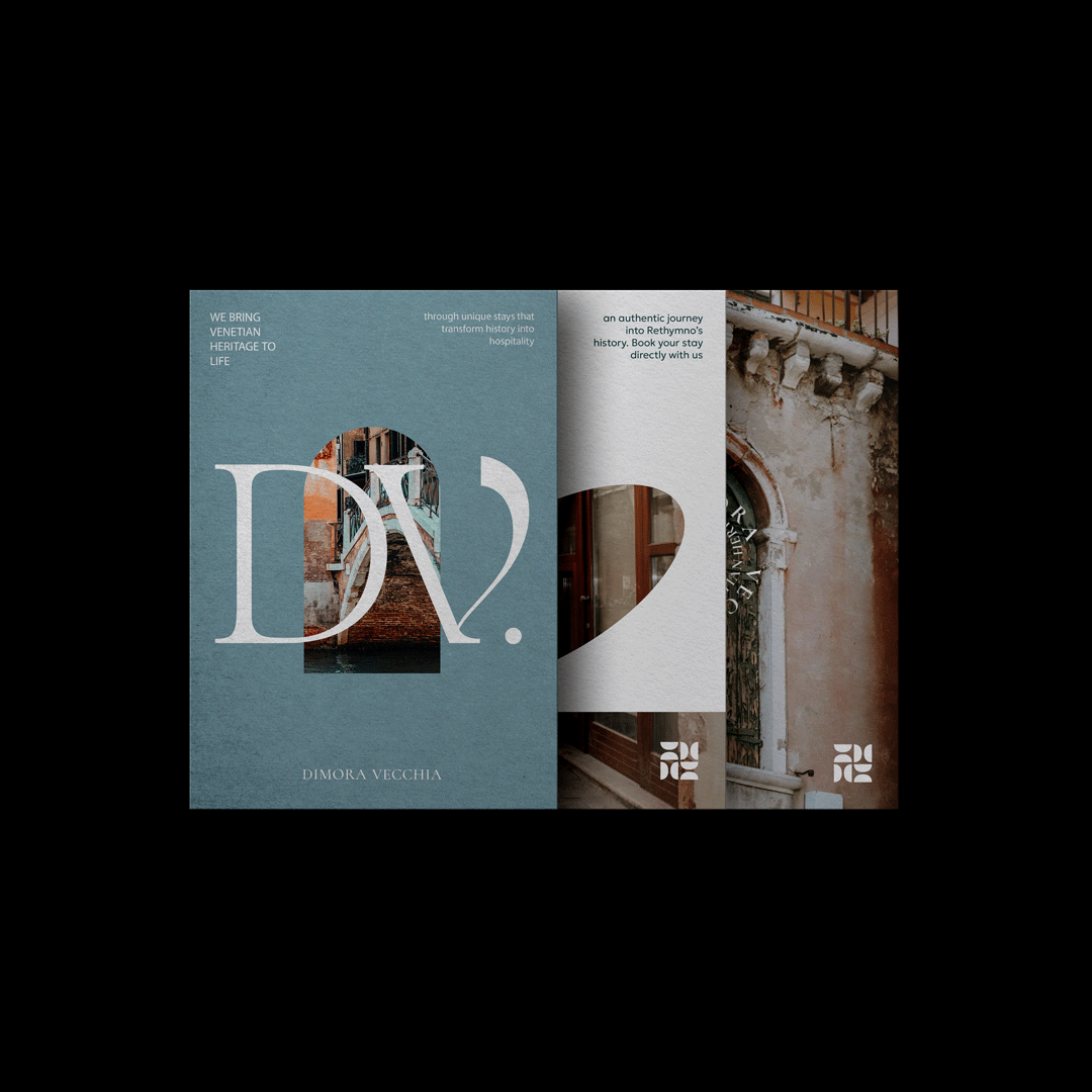
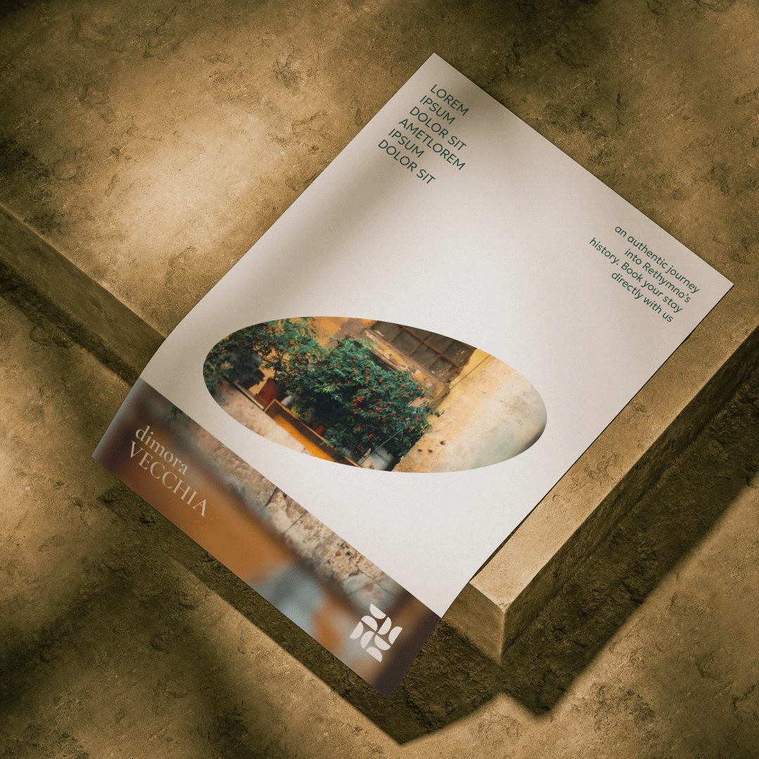
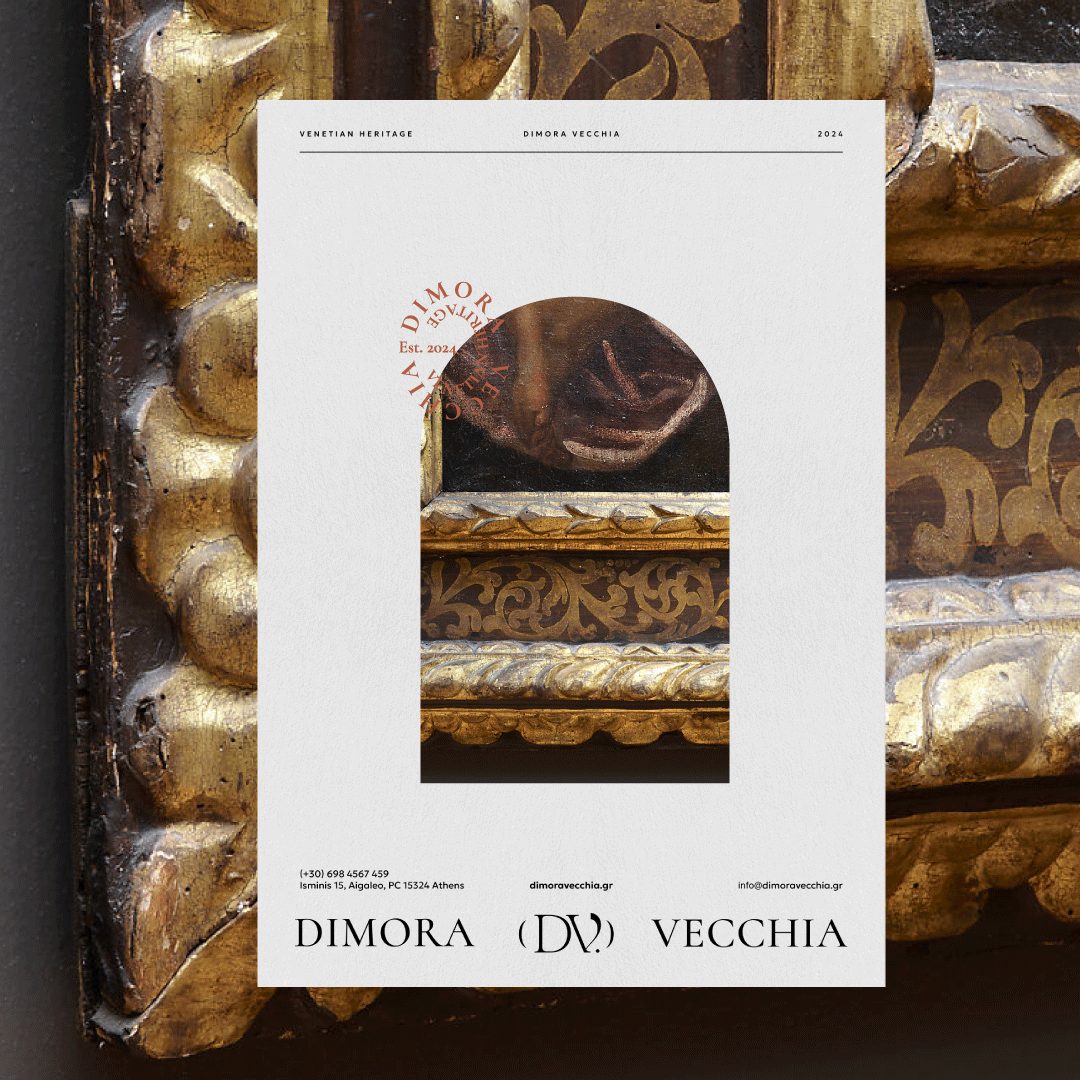
The typography balances timeless elegance and modern clarity. Headlines in the serif font Cormorant convey gravitas and sophistication, while subtitles and body text in the sans-serif Geologica Cursive add readability, contemporary precision, and hierarchy. This combination creates a refined, professional identity with a subtle contrast between classic and modern elements.
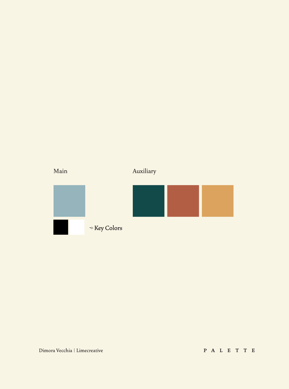
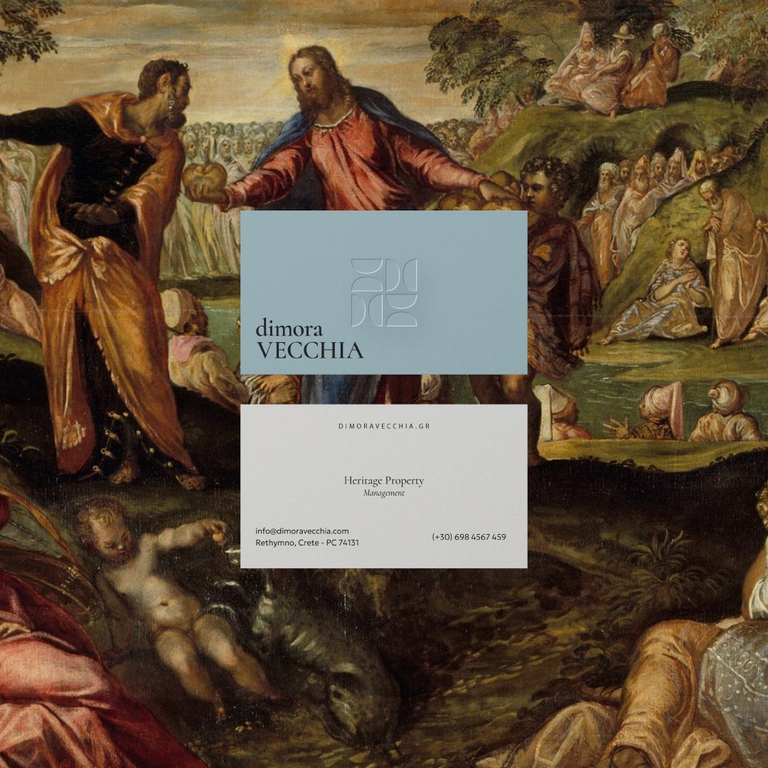
The color palette combines a refined foundation with warm, heritage-inspired accents. Primary colors include a soft teal, black, and white, establishing clarity, authority, and versatility. Secondary colors deep teal, terracotta, and golden ochre add depth, richness, and a sense of historical materiality. Together, the palette communicates trust, sophistication, and cultural awareness, creating a visual language that is both professional and evocative of Dimora Vecchia’s expertise in historic estate management.
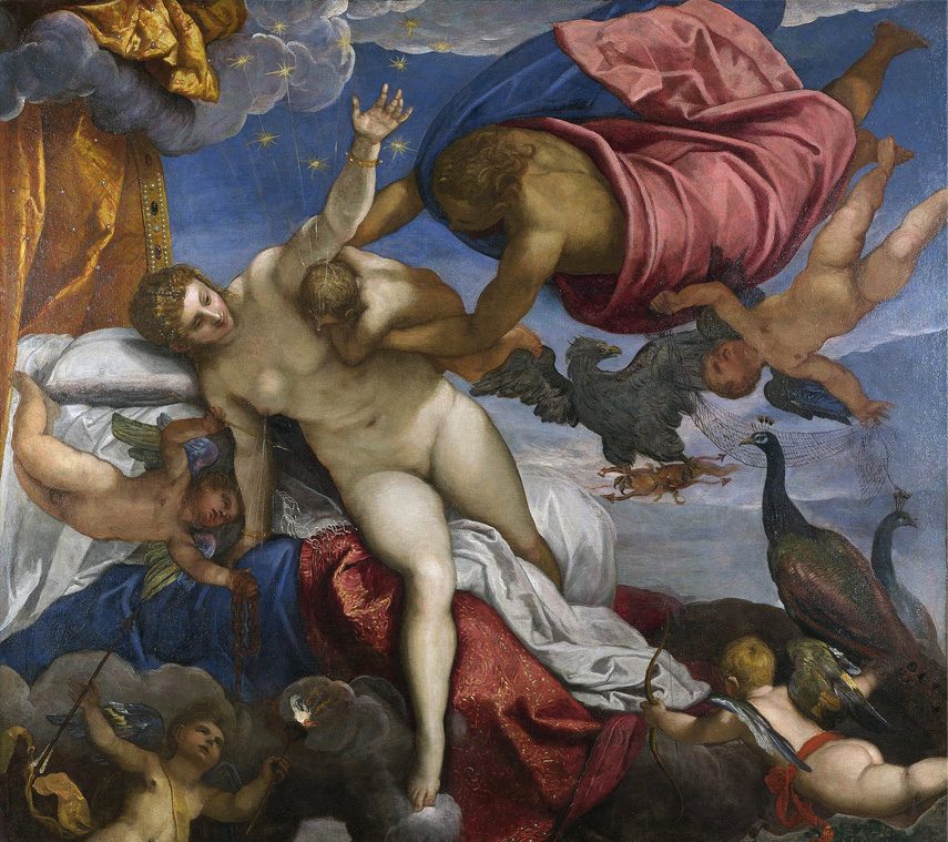
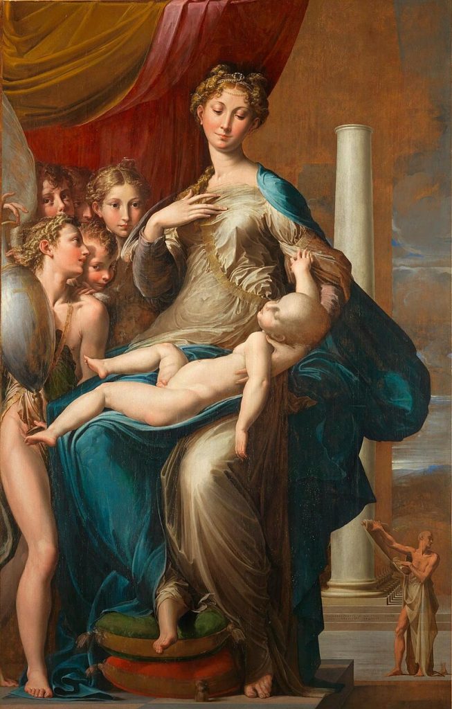
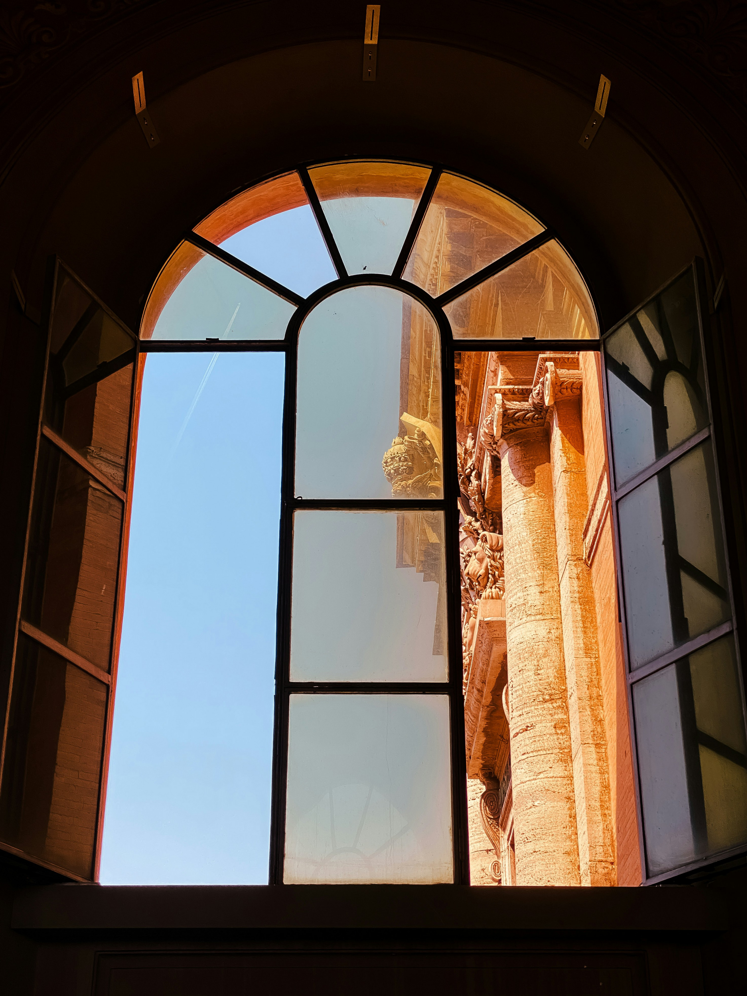
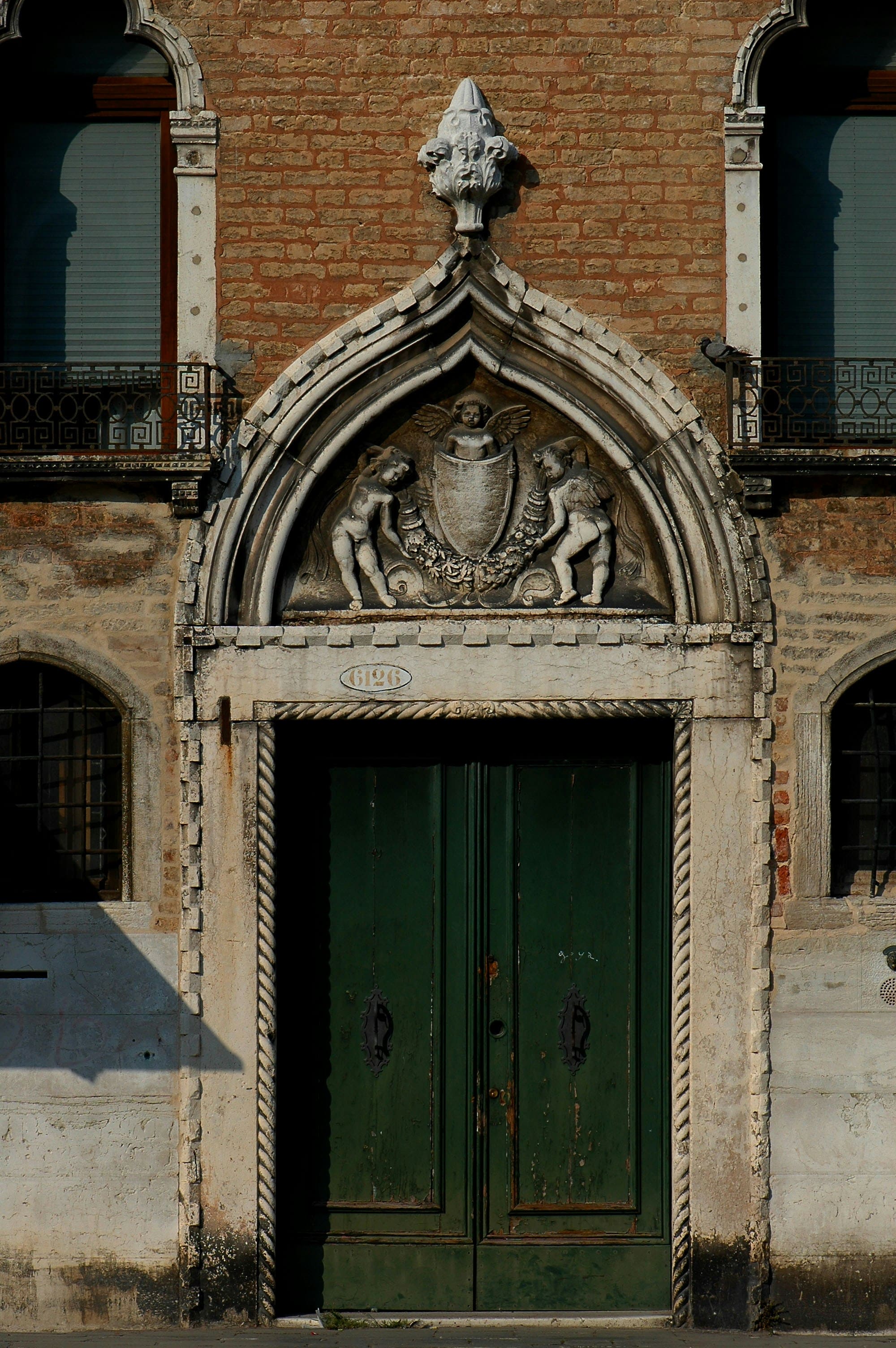
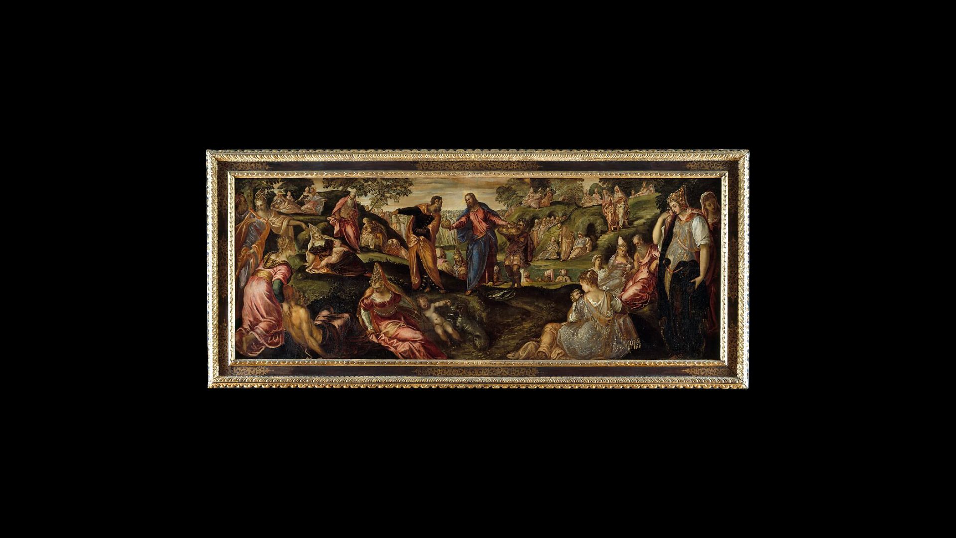
The imagery for Dimora Vecchia focuses on heritage, architecture, and curated spaces, highlighting the company’s expertise in managing historic estates. Photographs emphasize light, texture, and architectural details, capturing the elegance and character of properties under their stewardship. The visual approach balances authenticity with sophistication, showcasing environments in a way that feels lived-in yet meticulously cared for, reinforcing the brand’s narrative of expert management and cultural appreciation.
The resulting branding delivers a distinct, immersive identity that clearly communicates Dimora Vecchia’s expertise in heritage estate management. Typography establishes hierarchy and elegance, while colors evoke sophistication and cultural depth. Imagery presents curated properties with authenticity and care, and the brand voice conveys authority, confidence, and approachability. Across all touchpoints , digital, print, and environmental , the brand consistently projects expert stewardship, refined taste, and cultural awareness, giving Dimora Vecchia a memorable and professional presence in the heritage management sector.
