Lime Creative-Snami travel branding - Branding, Lime Creative

Snami travel branding

BRANDING
concept/

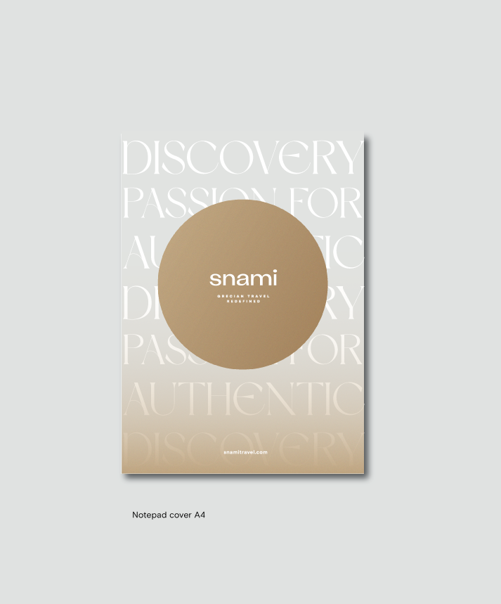
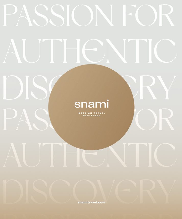
Snami Travel is about Greece, not just the places you visit, but the feeling that stays with you. Sun-warmed stone, deep blue seas, and textures of the landscape. Every color, every material, every detail was chosen to reflect the grounding, timeless quality of Greece .A place that feels familiar, yet always new.

We drew inspiration directly from the natural environment and the Minoan era, connecting deeply to the island’s cultural heritage. The soft, mineral tones of sun-faded stone, the deep maritime blues, and earthy neutrals that feel warm and lived-in. These colors aren’t just beautiful, they serve to evoke calm, balance, and a sense of authenticity in every interaction with the brand.

Visit website
Lime Creative--Snami travel branding
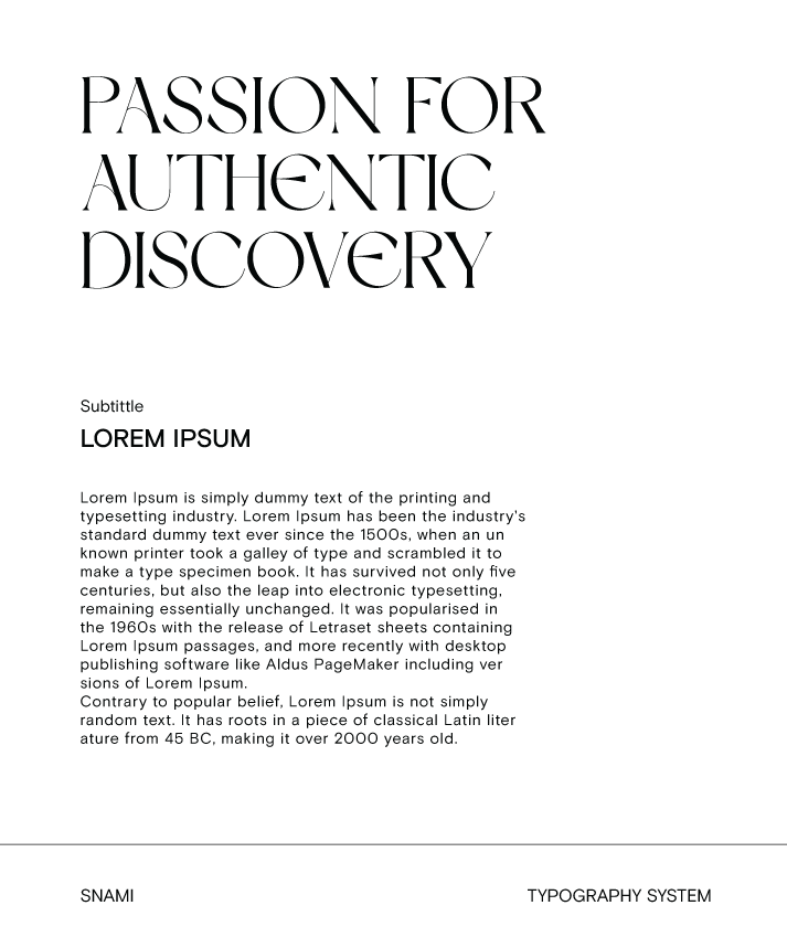
For typography, Dream Avenue is used for headlines, providing presence and clarity. Basis Grotesque Arabic is used for body text and subtitles, offering readability and balance. Together, they create a consistent, structured, and approachable hierarchy that supports the brand’s message.

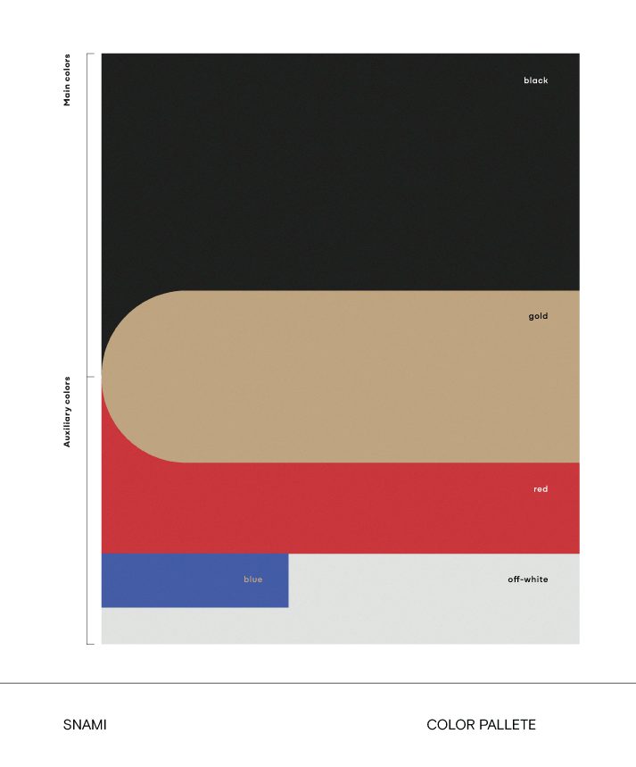
The color palette is deliberate and structured around a hierarchy. Black is the primary color. It provides presence, clarity, and a grounding elegance across all brand applications. Secondary colors ( gold, red, blue, and off- white) are used to complement black, adding warmth, depth, and subtle contrast. Gold evokes the sun-warmed stone and the elegance of Greece. Red adds small points of energy, blue references the sea and sky, and off – white keeps compositions clean, airy, and modern.

Lime Creative--Snami travel branding
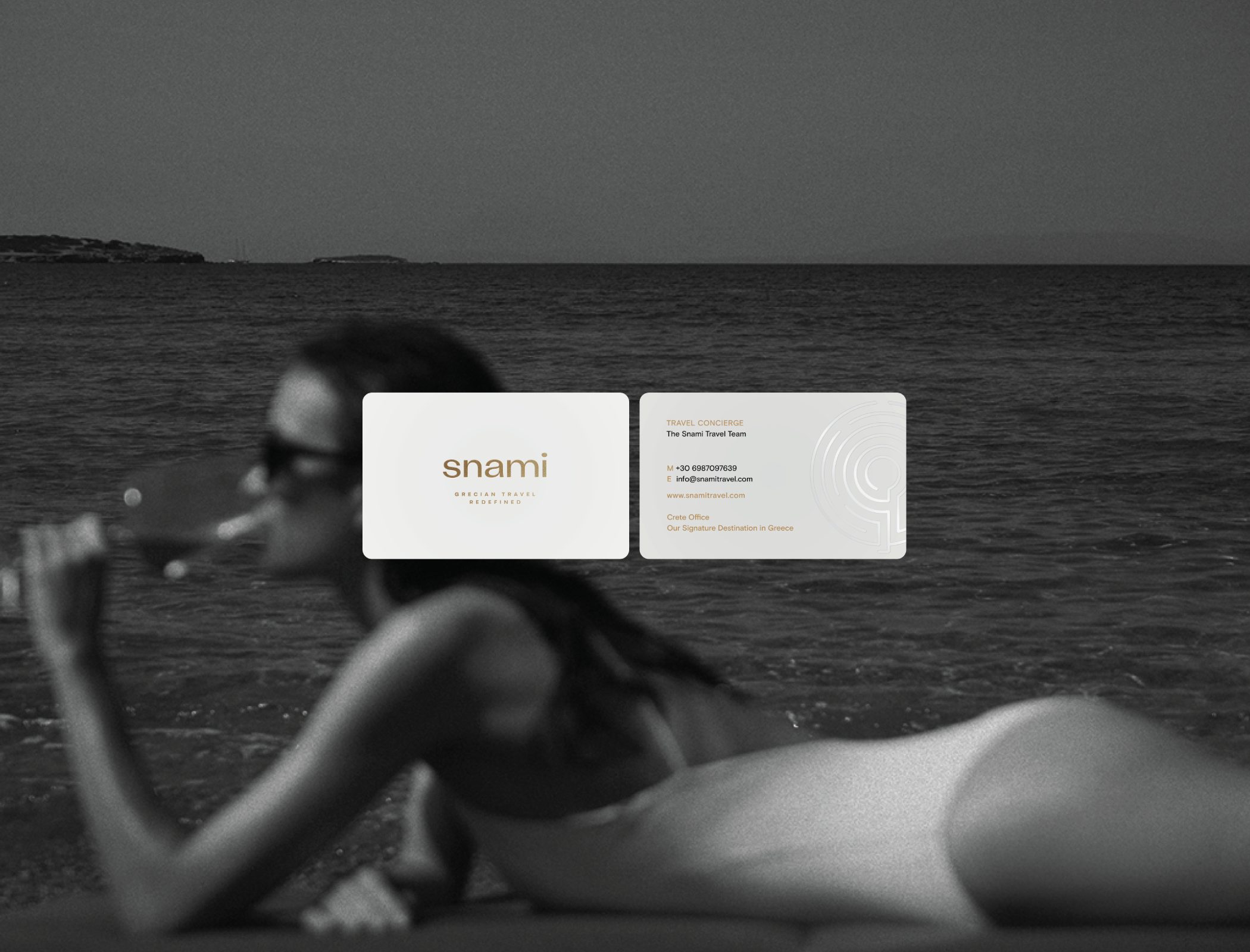
The Snami Travel logo combines a refined wordmark with a simple visual symbol: a labyrinth that reflects the brand’s deep connection to Crete and its cultural heritage. The wordmark carries the brand name with clarity and elegance, while the labyrinth serves as a visual anchor, representing journey, discovery, and meaningful exploration.

This symbol ties the brand to Greek history and tradition, echoing the idea that travel is not just about reaching destinations, but about the experience and insights gained along the way. Designed to work across digital and print applications, the logo embodies the brand’s values of quiet sophistication, authenticity, and timeless presence.

Lime Creative--Snami travel branding
Ultimately, Snami Travel taught us that true elegance comes from clarity and purpose, from designing every element to support a cohesive, human, and memorable experience rather than just visual beauty.
Lime Creative--Snami travel branding